
Theme your system
Open Customize in your local docs site. You can try a starting theme, refine its shared decisions, and see the result on real components.
Choose a starting point
Pick a starting theme in the summary bar. Each choice sets a coordinated identity across color, typography, shape, spacing, material, and motion.
- Minimal keeps neutral colors and restrained depth.
- Gold combines warm actions with rounded, polished surfaces.
- Bookish pairs wine and coral accents with reading-focused type.
- Editorial uses flat ink-and-paper surfaces and serif headings.
- Night uses cool accents and glass material.
- Garden brings forest, clay, and gold together with soft corners.
Refine one family at a time
Open a summary on the overview to edit that subject. Choose Overview to return.
| Editor | Try |
|---|---|
| Palette | Change your brand seeds, then compare light and dark specimens. |
| Typography | Choose a body font and a heading font. Check a heading beside a form label. |
| Size & spacing | Adjust control roominess and spacing while comparing the size ladder. |
| Material & light | Move the light source and compare matte and polished surfaces. |
| Motion | Replay the motion study and open the example popover. |
Edits apply immediately. Use Undo, Redo, or Reset in the summary bar as you explore. Theme decisions explains the detailed controls and derivation rules.
Check your own components
Choose Browse components to find an example in your discovered catalog. Preview your common forms, navigation, and content alongside one another. Add your components shows how to include your own definitions and examples.
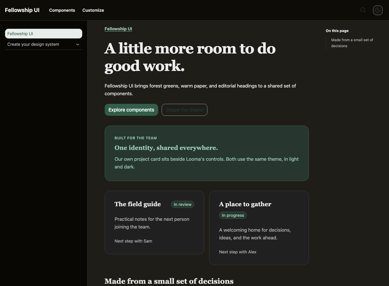
Every generated theme includes light and dark palettes. Use the appearance button to compare both. In your application, leave data-theme off the document root to follow the system, or set it to light or dark for a fixed mode.
Save and continue
Open Export & save. On your local site, saving updates the configured JSON recipe and CSS. A static site offers downloads. Import a recipe to continue editing it later.
Load the CSS after Looma's styles in your application. Re-save your recipe after a Looma upgrade to pick up updated derivation rules. Keep handwritten overrides in their own file.