
Create your design system
Give your product its own colors, type, and component library. Looma gives you a local documentation site where your components and theme stay together.
1. Start your local site
In a project with a package.json, run:
pnpm add @threadlabs/looma
pnpm add -D @threadlabs/looma-docs
pnpm exec looma-docs init \
  --title "Fellowship UI"
pnpm exec looma-docs dev
Open the address printed in your terminal. You can browse Looma's components and choose Customize to start shaping your theme.
2. Make it yours
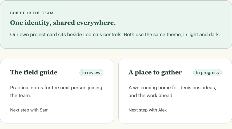
Choose a starting theme, then adjust color, typography, spacing, and material. Changes appear across the site and its live component examples as you edit.
Theme your system walks through choosing an identity, checking light and dark, and saving the result.
3. Use it in your application
Initialization creates your configuration and two theme files:
| File | Purpose |
|---|---|
looma.docs.json | Your site name, components, and documentation. |
looma.theme.json | Editable theme decisions. |
looma.theme.css | The generated CSS your application loads. |
Import the generated theme after Looma's styles in your application entry:
import "@threadlabs/looma/tokens.css";
import "@threadlabs/looma/theme-light.css";
import "@threadlabs/looma/theme-dark.css";
import "./looma.theme.css";
Save from Customize → Export & save to update the local theme files. Commit them with your application and add .looma/ to your ignore file.
Keep building
- Add your components: put your HTML Next definitions, examples, and API reference beside Looma's.
- Publish your system: add your branding and share a static documentation site.
- Theme decisions: look up the rules behind color, type, material, and motion.